The interior of the Bunkhouse set is distinguished by dangling bedsheets that disquietingly block the view across the room and an attention-grabbing, violently spasming "Kicker" animatronic tied up in a sleeping bag on a top bunk as a punishment for some undisclosed transgression. These distract from the room’s Scare Opportunities: one, a locker door that uncharacteristically swings inwards (for practical purposes, we don't want to risk smacking people passing by) to reveal a screaming, grasping, bloodied Scout stuffed inside; and two, an abusive Coach ScareActor who lurches out at the guests.
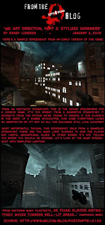
Now, take note: inasmuch as this particular room is at the perimeter of the construction, there is a required fire exit off to the side. Both venue security personnel and the Coach character (we'll meet him tomorrow) can corral guests away from this pathway during normal operations, however, there is a much more basic motivator directing guests to the next intended room: brighter light. Here is an excellent example of Art Direction in lighting design for the purpose of navigation, from Valve Software's "Left 4 Dead" video game:
Source: l4d.com/blog/post.php?id=2129
"We found that players instinctively moved towards well-lit areas" is the takeaway lesson from Valve's beta testing, and the impetus for lighting the next room so brightly. Painting a big red directional arrow on the wall helps, even if it is in blood.


No comments:
Post a Comment